Dashboards in Salesforce for Project Management

Cloud Coach

Oct 7 2022 10 min read

In project management, managing your projects in an organized manner is the key to success.

Dashboards in Salesforce overview

A study from the National Journal of Production Research demonstrates that visual management systems (like dashboards in Salesforce) support the following: ongoing strategy development and implementation, facilitate performance measurement, enable people engagement, improve internal and external communication, and development of improved innovation. 

With that being said, when a business has the resources to view visual representations of their key metrics and milestones there is a higher likelihood of achievement in the work place. A dashboard in Salesforce does just that by offering a visual display of key metrics and reports for your organization. In this blog we will review what a dashboard in Salesforce is and how Cloud Coach best leverages this tool to help your project management organization thrive. 

What are Dashboards in Salesforce?

The fundamentals of dashboards in Salesforce are simple. As mentioned above, dashboards in Salesforce give users the ability to see key metrics for records within their organization. In other words, dashboards created in Salesforce are a graphical representation of Reports that show data from source Reports as visual components. 

For each time a user creates a dashboard in Salesforce they are able to view multiple reports that often have a common theme of: 

  • sales performance
  • customer support
  • user activity
  • project status
  • visibility of a variety of statistics
  • view of opportunities requiring priority attention

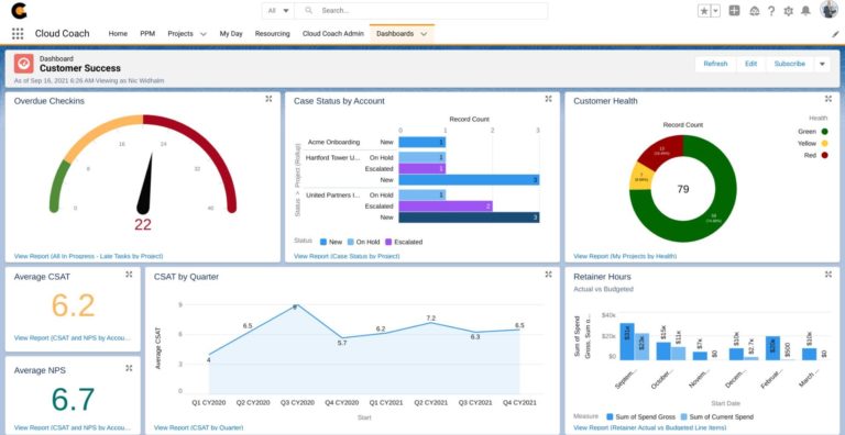
See below a snapshot of dashboards created in Salesforce by Cloud Coach.

Project managers dashboard 2

Hello 👋 I'm here to help you!

The benefits of using Salesforce Dashboards

Dashboards in Salesforce will bring your project management company the following benefits:

  • Custom metrics for specific user roles: By using dashboards, users are able to configure different view for different roles. For example, there could be an executive dashboard that only shows high level reports or a finance dashboard that specifically displays expense and revenue reports. This allows for each role to have a single source they can go to every day to stay updated on record changes in Salesforce- ultimately resulting in increased visibility and innovation for each team member. 
  • Real time update: When records are changed, the dashboards that house those reports will update automatically with all the new information. An example of this is when an opportunity stage changes. This will appear on the report if it is tracking the opportunity and stage of the opportunity. 
  • Custom components can be added to lightning pages: Any dashboard that is created can be added to a custom lightning page. This allows for quick and easy access to specific metrics from any custom lightning page that a user wants to create. Adding a lead dashboard to the homepage of a sales agent is a prime example of this, as it would allow easy access to data that they would need to view on a daily basis.

Creating a Dashboard in Salesforce

In Salesforce, dashboards are very easy to setup and can be extremely useful to your project management company. When designing a dashboard in Salesforce, you should consider what information you need to review, and what action items you want to take from this data. Then, your Salesforce dashboard can provide real-time data based on the reports you build, allowing you to quickly and easily keep an eye on key statistics.

What types of Dashboard are there in Salesforce?

There are many different ways to display data on a dashboard. In order to determine which type of dashboard you should use should be classified by asking yourself questions like: Do you want to see all information about users activity? Are you creating a team dashboard for a manager? Is this a dashboard for all activities related to a team’s project? Once you have distinguished what your goal is, you can apply your metrics through the following visual displays: 

  • Pie Charts
  • Horizontal Bar Chart & Vertical Bar Charts
  • Gauges
  • Metrics
  • Tables

Pie Chart in Salesforce

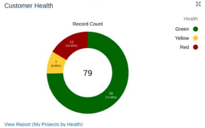
Pie Charts in Salesforce are excellent when you want to display data as portions of a total. This could be used for viewing a project status when you want to see a number or percentage for the status field.

pie chart

Horizontal Bar Chart & Vertical Bar Chart in Salesforce

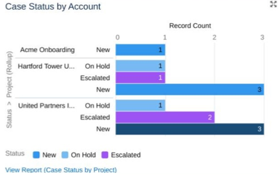
Horizontal & Vertical Bar Charts in Salesforce are used to show data based on location or stage. For example, you could use this for activities each day where you want to see a trend. This chart type is extremely useful for better organizing your schedule or for reviewing staffing requirements over time.

bar chart

Gauge Chart in Salesforce

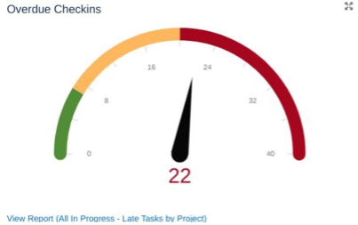
Gauge charts are useful when you have a single value that you want to show within a range of custom values. For example, you could have a goal of completing their tasks assigned in a given month. They can be assigned by either Red, Amber and Green Values.

gauge chart

Metric Chart in Salesforce

A metric component is a single value and is associated when you need a quick view of the number of days or amount of something in the pipeline. Most commonly used for easy view for sales amounts.

Table Chart in Salesforce

A table chart is very similar to a spreadsheet. With this chart you can display a list of data, and select the maximum number of rows to display so you don’t crowd your dashboard. 

Overall, each dashboard can be tailored to a user and their specific needs. The next section will further discuss dashboards within Cloud Coach and their specific qualities.

Dashboards within Cloud Coach

One of the major benefits of Salesforce dashboards within Cloud Coach is custom applications. Custom applications allow the user to extend benefits of their functionality within customer User Interface elements. For example, Cloud Coach best practices this tool by leveraging reports created from Projects, Tasks, Tickets, or any other managed object. These reports can then be surfaced on a dashboard with custom filters and configurations. 

When creating a dashboard, Cloud Coach first considers the following:

  1. Determine the goal of your dashboard
  2. What information do you and your users want to see
  3. Do your users have the right permission sets to see the data in your dashboard?

By considering these questions prior to creating your dashboard, this allows Cloud Coach to create the most accurate and appropriate dashboards for each user. Whether you are looking for project management, or professional services automation tools on the Salesforce platform, Cloud Coach has the tools for you.


AUTHOR

Cloud Coach

Cloud Coach specializes in enterprise-class project, PSA & PPM software built for businesses that want to make strategic investments in their success.

Related Articles

Want to see Cloud Coach in action?

Cloud Coach is secure and customisable platform for successfully delivering customer projects of all shapes and sizes.

See Cloud Coach In Action

Cloud Coach is secure and customisable platform for successfully delivering projects of all shapes and sizes.

Schedule a tailored demo with one of our project specialists.

  • Fill out the form below
  • Our team will reach out within 24 hours to discuss your unique requirements
  • We’ll schedule a 1:1 demo with one of our product specialists  
medal 2 1
reCAPTCHA logo@2x

protected by reCAPTCHA

medal 2 1

Thank you

A Cloud Coach advisor will be in contact by email within one working day to arrange your demo.