Creating a Financial Reporting Button for your Investments

Nic Widhalm

Oct 17 2016 7 min read

Investments are one of those tools in Cloud Coach that is so powerful it can easily intimidate new as well as veteran users. Not only does it utilize robust scoring to determine whether your investment is worth pursuing, but it also allows for financial project planning on a monthly, quarterly, and annual schedule. What does this mean for your business organization? Well, how about reports that show exactly what you’ve planned to spend on investments, as well as your total costs as you progress through your schedule?

Not good enough yet?

Alright, how about a button that launches you into said report from the convenience of your investment detail page?

Now we’re getting somewhere. So what do we need to do to create this simple workaround?

Step One: Create Your Report

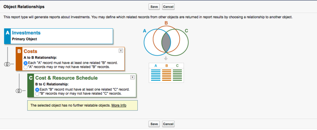
Once you’ve entered amounts in the Direct Financial Costs section of Investments you’re ready to create a report to capture those planned and actual costs. Let’s start by creating a Report Type that lets us pull in Investments, Cost, and Cost Schedule:

Screen Shot 2016 10 14 at 4.43.36 PM 1024x421

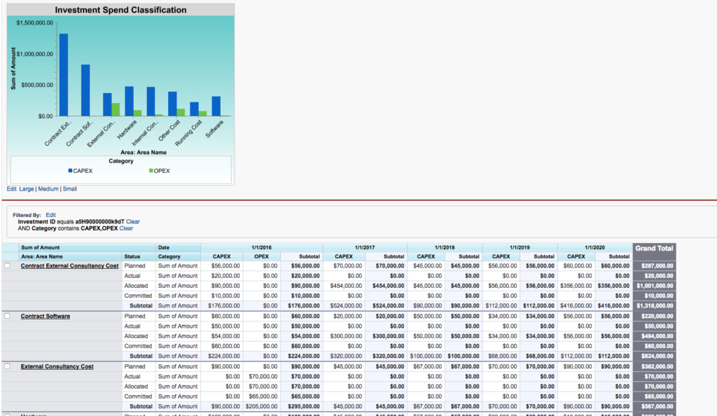
Then create a new report and group by Investment, Cost Area, Status, and Date. When you’re done you should have an investment report that looks something like this:

Your status options may vary depending on what makes sense for your business org, but in the case of our example, we’ll use Planned, Allocated, Committed, and Actual. Now we can see exactly how our spend is progressing across date periods, status, and area, and we’re ready for the next step—launching the report from a button on investments.

Step Two: Create Detail Button

So what’s the benefit of having a button on your Investment detail page, rather than just going to reports or using a chart? Convenience for one; with a button we’re looking at one click rather than the two or three it takes to navigate to Reports or Dashboard, and then dive into the report itself. Detailed information for a second—a chart may give you a few bits of info on your investment, but the report we created has four different groups it’s showing, as well as an amount field and any other custom information we may want to include. Simply put, a chart isn’t going to cut it.

So we need a button.

This is one of my favorite features in Salesforce, because it’s simple to implement and saves a boatload of time. Let’s start by going into our report that we just created and capture the ID number:

Once we’ve grabbed the ID we’re ready to create our report button. Go to Setup -> Create -> Objects -> Investments and navigate to the Buttons, Links, and Actions:

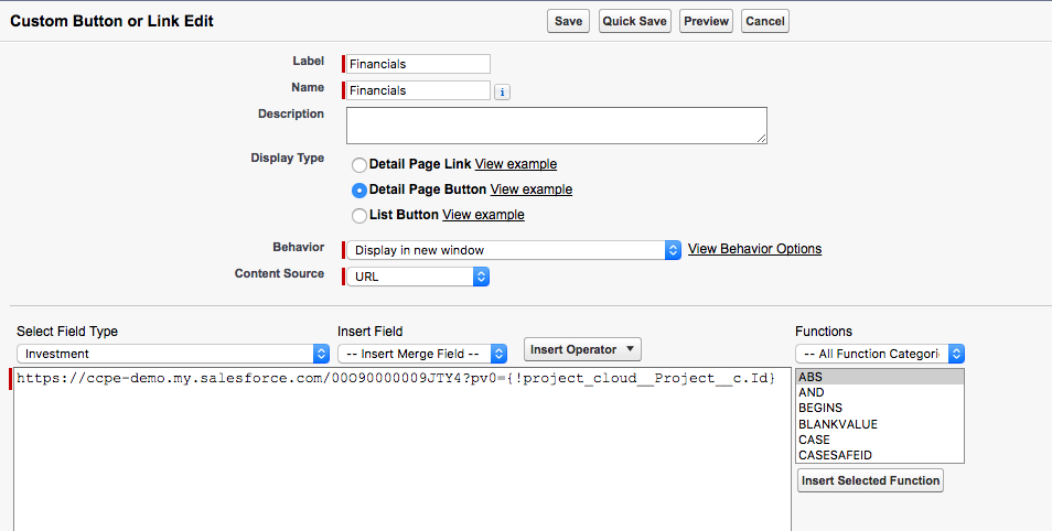
Click “New Button or Link” and give your button a snappy name like “Financials.” Then, in the formula editor below, enter the following snippet (making sure to put your report ID in place of the one in the picture):

Makes you choose the option to have it as a Detail Page Button, then save it and move on to the next step.

Step Three: Add Button to Page Layout

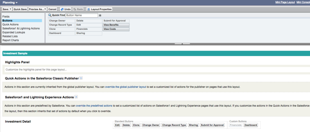
We’re almost there. But before we can test our snazzy new button we have to add it to the Investment page layout. Lucky for us, we’re already in the Investment object setup page, so this will be a snap. Navigate to the Page Layout option, and pick edit (Note: Investments is an object with several record types, so make sure to add it to whichever page layouts you wish to use):

Once we’re in the page layout we’re going to select Buttons and find our new “Financials” button:

And now we simply drag it into our Custom Buttons section of the Page Layout and we’re good to go:

Now for the fun part! Let’s go to our investment page and test it out:

That’s a fine looking investment button if I do say so myself.

Conclusion

That’s all there is to it, and you can see just how easy it is to implement. I’m the first to admit that I love a good chart on my detail pages, but I also love quick access to important data, and when you need a single click to get you that chart info stat—well, there’s just no better way than creating a report button. And the uses go far beyond Investments. You can probably already see the possibilities for report buttons you can place on your project detail pages to take you to expense info, costing data, and historical snapshots to track your timeline.

It’s just that easy.

AUTHOR

Nic Widhalm

Nic is the Global VP, Customer Experience, at Cloud Coach

Related Articles

Want to see Cloud Coach in action?

Cloud Coach is secure and customisable platform for successfully delivering customer projects of all shapes and sizes.

See Cloud Coach In Action

Cloud Coach is secure and customisable platform for successfully delivering projects of all shapes and sizes.

Schedule a tailored demo with one of our project specialists.

  • Fill out the form below
  • Our team will reach out within 24 hours to discuss your unique requirements
  • We’ll schedule a 1:1 demo with one of our product specialists  
medal 2 1
reCAPTCHA logo@2x

protected by reCAPTCHA

medal 2 1

Thank you

A Cloud Coach advisor will be in contact by email within one working day to arrange your demo.